

Custom Web Design in Miami Built Around How Your Business Actually Works
We design website experiences around how people discover, compare, trust, and choose your business, instead of around a prebuilt layout.
We start with the questions that shape the site: what visitors need to understand, what can stop them from moving forward, which paths matter most, and where each journey should lead. The polished screens come from those answers.
Miami-based · Custom scope · No generic website package.
What Actually Makes Web Design Custom
Custom web design defines a website's structure, journeys, page patterns, visual language, and responsive behavior around the requirements of one specific business. The deeper difference is where the design decisions come from.

Begins with an existing arrangement and asks how the business can fit inside it.
Begins with the business, the audience, the content, the decisions the website needs to support, and the changes it may need to absorb over time.
Requirements Drive the Layout
We start from what the website must help people understand, trust, find, compare, and do. Familiar patterns are used when they fit the problem, and each one is justified by that fit.
Repetition by Design
Custom still needs recurring rules, reusable components, and recognizable patterns. When the same need appears often, the system supports it consistently. When the need changes, the structure changes for a reason.
Every Choice Justified
Each extra layout or variation has to stay coherent later, so customization should be justified. "We wanted this page to look different" is not always a good enough reason.
When Is Custom Web Design Actually Worth It?
Not every business needs a custom website. A quality template can be a rational choice when the requirements are simple, stable, and familiar. The real question is whether a generic system can support what the website needs to do without creating compromise or rework later.
| A quality template may be enough | Custom design is worth it |
|---|---|
| One primary audience | Audiences need meaningfully different paths or explanation |
| A small number of pages | Page types perform different jobs and resist one layout |
| One clear action | Specialized content that standard patterns compromise |
| Little expected structural change | Positioning must be visible before the sales conversation |
| Conventional, familiar requirements | Likely growth in services, locations, or markets |
| A clean, stable current site | A current site already dependent on workarounds |
If only one or two conditions on the right apply, a quality template may still be the better investment. If several apply at once, the cost of constraint deserves as much attention as the launch price.
The Cost of Custom Shows Early. The Cost of Constraint Shows Later.
A custom website requires more thinking upfront, and that cost is visible. Constraint tends to accumulate more quietly. To understand the cost of custom web design against every other option, and to estimate your custom website investment over three years, start there before you compare quotes.
A new requirement appears, a service, location, audience, or language.
The closest existing pattern is reused even though it does not quite fit.
Similar pages begin solving similar problems in different ways.
Future changes need more interpretation, more exceptions, and more rework.
Your Website Should Match How Visitors Actually Decide
A customer journey is a working model of what different visitors may know, question, need to trust, and be ready to do at different points in the experience.
We Design Around Decision States
Demographics alone do not tell an interface what to do. Two people with very different backgrounds may arrive in the same decision state. Two people who look similar may need completely different experiences.
Someone enters through a service page, checks proof, visits a location page, then leaves.
They return later through a brand search, and only then contact the business.
Another visitor starts with a guide, compares options, and discovers a different service fits better.
When a Journey Should Stay Shared, and When It Should Split
Different visitors do not automatically need different pages. Several decision states may share one service page if the hierarchy makes room for different needs without letting the page lose focus.
Separation becomes more useful when the decision logic materially changes, for example when terminology, eligibility, process, proof requirements, or the next action are genuinely different. Journey models remain hypotheses, and real behavior refines them.
How Your Pages Connect Decides Whether People Get Lost
Information architecture defines how content is organized, separated, connected, labeled, and made navigable before visual design determines how those relationships appear on screen. We treat the sitemap as a model of how the website needs to make sense.

We Separate Topics From Jobs
Two pages may discuss the same subject and still perform different jobs. The topic overlaps while the function stays distinct.
| Page type | The job it performs |
|---|---|
| Service page | Helps someone evaluate an offer |
| Guide | Helps someone understand a problem |
| Comparison | Helps distinguish options |
| Case study | Provides evidence |
| Industry page | Establishes relevance in a specific context |
A Website Needs Hierarchy and Relationships
Navigation is one interface to the structure, and the whole structure is larger than the menu. Some relationships are hierarchical. Others are lateral, contextual, evidential, or educational.
Architecture Has to Survive Real Growth
A structure may look elegant with twelve pages and become incoherent after new services, locations, languages, case studies, and content types are added. Growth exposes weak categories, crowded navigation, and page types that multiply without rules, so the architecture considers what exists now and which kinds of change are reasonably likely.
The Order of a Page Decides Whether It Works
With the architecture set, wireframing brings those decisions into the page itself. This is where structure becomes sequence.
The Right Information Can Still Be in the Wrong Order
A page may contain everything a visitor needs and still create friction because the sequence is wrong. The correct order depends on what must become clear before the next idea becomes useful, so we design the sequence per page.
Wireframes Expose Problems Early
Removing visual polish makes structural weaknesses easier to see: two sections repeating an idea, a page doing two jobs, missing content, or a mobile hierarchy that needs more than simple stacking. Sometimes the answer is to add, sometimes to move, sometimes to remove a whole section.
The Wireframe Is the Output of the Logic
A useful wireframe reflects decisions already made about the job of the page, the visitor's starting condition, the information sequence, and the next meaningful step. It gives those decisions a form that can still be challenged before the visual system is applied.
A Custom Interface Needs a Visual System
The hard problem is making an entire website feel intentional when the content, page types, actions, and contexts keep changing. That requires a visual system: how the interface creates hierarchy, expresses the brand, signals action, handles repetition, and introduces variation while keeping coherence.
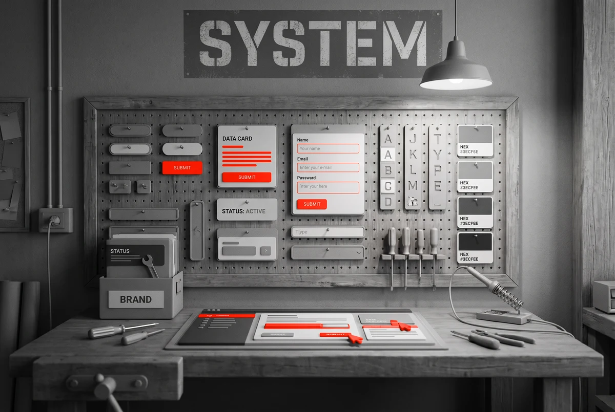
Brand Expression Becomes a Set of Interface Decisions
A brand intention becomes useful when it influences concrete choices such as visual density, type hierarchy, image treatment, motion, emphasis, contrast, and whitespace.
Precise
Without becoming cold.
Premium
Without becoming distant.
Energetic
Without becoming chaotic.
Approachable
Without becoming generic.
Consistency Allows Different Compositions
Buttons, forms, navigation, proof blocks, and calls to action stay consistent enough to remain understandable. A case study can still behave differently from a service page, and a comparison may need a denser structure.
A System Reduces Future Guesswork
New pages inherit established decisions about hierarchy, spacing, typography, color roles, and component behavior, with enough flexibility to handle longer titles, uneven proof, and real bilingual content.
Conversion Is the Reduction of Uncertainty Before Action
A large button does not resolve confusion. A sticky call to action does not create trust. A shorter form does not fix an offer that remains unclear. Conversion-oriented design considers what may prevent someone from moving forward, and whether the page gives enough clarity, relevance, evidence, and direction.
The Next Step Should Match the Level of Readiness
Not every visitor is ready for the same action. A page does not need five competing buttons, and the action hierarchy should reflect the role of the page and the likely state of the visitor.
| Visitor readiness | A reasonable next step |
|---|---|
| Already understands the offer | Book, call, request a quote, or start a consultation |
| Still evaluating | View a case study, compare options, check a location, or understand the process |
Doubt Should Guide Where Evidence Appears
Evidence is often stronger when it appears near the uncertainty it resolves. A claim about expertise is supported by relevant work; a claim about an easy process, by a clear explanation of that process.
When Friction Is Useful
Some decisions benefit from useful friction. A qualification step may prevent the wrong inquiry, a clear explanation of commitment may reduce poor-fit leads, and a more detailed form may fit when the information affects what happens next.
Responsive Design Rethinks the Page for Each Screen
A desktop layout can let explanation, proof, navigation, and action coexist in the same visual field. On a smaller screen, those elements become a sequence. Responsive design preserves clarity, hierarchy, and intent under different constraints.
Desktop: elements coexist
Mobile: priority decides the order
Simply stacking desktop columns from left to right can preserve the content while destroying the intended priority.
Interaction Survives the Change in Input
Hover states are the obvious example, and the issue also affects navigation, expandable content, comparison controls, tables, sticky elements, and multi-step actions. The goal is to preserve what the interaction was meant to help someone accomplish.
Real Content Creates Real Pressure
A heading wraps to four lines, a Spanish label expands, one testimonial is twice as long as another. Those are part of the design problem, and a robust interface tolerates normal variation without depending on perfect symmetry.
Design Defines the Experience. Development Makes It Operate.
A finished screen is only part of the work. The design also defines behavior: what changes across screen sizes, how components respond to different content, what happens when someone interacts, and where variation is intentional. A good handoff makes that logic visible enough that implementation does not silently reinvent it.
Where Custom Web Design Connects to the Rest of the Work
Some projects need advanced integrations, custom business logic, or more complex backend functionality. Visibility is a separate discipline too. Design stays connected to each while solving a different problem.
Web Development
When the project needs integrations, workflows, APIs, or backend systems to make the experience operate.
Explore our complete web design services →SEO Services
When search visibility is part of the project, structure and content are coordinated for discovery.
SEO Services →AI SEO Services
When being found and cited by AI answer engines matters for the market you serve.
AI SEO Services →How a Custom Website Comes Together
Each step settles a decision the next one depends on, so the work moves forward without guesswork or rework.
Architecture
We map the pages your business needs and how they connect, so the structure makes sense before anything is designed.
Journeys
We model how different visitors decide, so the site guides the right person to the right next step.
Wireframes
We test the order and logic of each page in plain layout, while it is still cheap to move things around.
Visual system
We build the rules for hierarchy, brand, and interaction, so every page belongs to one website.
Responsive
We rework each page for every screen, protecting clarity, hierarchy, and intent as space and input change.
Handoff
We transfer the reasoning behind the design, so development builds what the design actually intended.
A Large Share of Your Miami Customers Search in Spanish
For many Miami businesses, English and Spanish customers land on the same website. Serving both well is a design decision, made from the first layout.
Your customers move between English and Spanish, and a large share search, compare, and decide in Spanish.
The site is built bilingual from the first layout, so each language reads like it was made for that audience.
From Hialeah and Doral to Brickell and Wynwood, the Miami market is bilingual by default, and the website should work the same way.
What the Process Feels Like From the Client Side
For the client, the work should feel simpler: clear communication, visible progress, and a website that reflects the business.


Questions About Custom Web Design in Miami
Scope can change depending on the business, the content, the number of page types, the complexity of the user journeys, and what the website needs to support after launch.
How much does custom web design cost in Miami?
How long does a custom website design project take?
Do I need custom web design, or would a template be enough?
Can tamer Marketing redesign an existing website?
What is the difference between custom web design and web development?
Can you design bilingual English and Spanish websites?
Will my custom website be responsive?
Do you also provide SEO for custom websites?
Your Website Should Fit the Business You Are Building
If your current website is forcing new services, audiences, locations, content, or customer journeys into a structure that no longer fits, the next step is understanding what the next system actually needs to support.